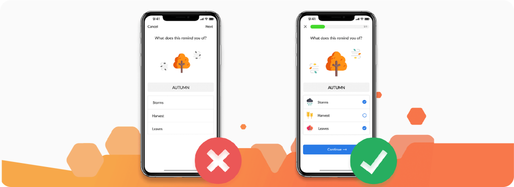
In the digital age, your website or app’s user interface (UI) and user experience (UX) design play a pivotal role in determining your business’s success. A well-designed UI/UX can create a seamless, enjoyable experience that keeps users coming back, while poor design can quickly turn visitors away, leading to lost customers, lower conversions, and negative reviews.
If you’re struggling with poor engagement or high bounce rates, it’s possible that your UI/UX design could be to blame. In this blog, we’ll dive into how poor UI/UX design could be costing you customers and offer actionable tips on how to improve your design to boost user satisfaction and conversions.

1. Confusing Navigation Leads to Frustrated Users
Navigation is one of the most critical elements of UI/UX design. If users can’t quickly find what they’re looking for, they’ll abandon your site or app without hesitation. Confusing or unintuitive navigation structures often cause frustration and lead to higher bounce rates, as users are unlikely to spend time trying to figure out how to use your website or app.
What to Do About It:
- Simplify your navigation: Ensure the navigation menu is clear, concise, and easy to understand. Group related content logically, and use familiar labels for each section.
- Implement a search function: A search bar helps users find specific content or products quickly.
- Make key information easily accessible: Important links like contact information, login buttons, or shopping carts should be prominently placed.
By designing an intuitive navigation system, you make it easier for users to find what they need, leading to higher engagement and fewer frustrations.
2. Slow Loading Times Drive Users Away
In today’s fast-paced world, users expect websites and apps to load quickly. Studies show that 53% of mobile users abandon a page if it takes more than 3 seconds to load. Slow load times, especially on mobile devices, can have a devastating effect on user retention, ultimately costing you potential customers.
What to Do About It:
- Optimize your website’s performance: Compress images and videos, minify code, and implement caching to improve loading speed.
- Use a content delivery network (CDN): A CDN helps distribute content faster by caching static assets across servers located closer to the user’s geographic location.
- Remove unnecessary elements: Too many heavy features or complex animations can slow down your website. Evaluate and prioritize the essential elements that need to be on the page.
Faster load times create a smoother user experience, reducing abandonment rates and increasing the likelihood of users staying on your site or app longer.
3. Cluttered UI Creates Cognitive Overload
A cluttered or overly complex UI can overwhelm users, making it difficult for them to focus on what’s important. When there’s too much going on, users may not know where to look or what actions to take, leading to confusion and disengagement.
What to Do About It:
- Adopt a minimalist design: Focus on the essentials. Remove unnecessary elements that distract from the core purpose of your website or app.
- Use whitespace effectively: Proper spacing allows users to digest information in smaller, manageable chunks, improving readability and comprehension.
- Limit the number of options: Offering too many choices can paralyze decision-making. Use clear calls to action and guide users to make decisions without overwhelming them.
A clean, well-organized design ensures users can navigate your website or app without feeling overwhelmed, leading to a more enjoyable experience.
4. Unresponsive Design Results in Poor Mobile Experience
With mobile traffic now surpassing desktop traffic, having a responsive website or app is more important than ever. If your site is not optimized for mobile devices, you risk alienating a large portion of your audience. A poorly designed mobile interface can frustrate users, leading them to abandon the site in favor of a competitor’s.
What to Do About It:
- Implement responsive design principles: Ensure your website adjusts automatically to different screen sizes and orientations, providing a consistent experience across devices.
- Test on multiple devices: Always test your site on various devices and screen sizes to ensure that it looks good and functions well on smartphones, tablets, and desktops.
- Optimize touch interactions: Buttons and links should be large enough to tap easily, and forms should be simple to fill out on smaller screens.
A responsive design enhances the mobile experience and ensures that your website functions optimally across all devices, keeping mobile users engaged.
5. Unclear Calls-to-Action (CTAs)
If your website or app doesn’t clearly guide users toward the next steps, they may leave without taking any action. A lack of well-placed and clear CTAs is one of the most significant mistakes in poor UI/UX design. Users need direction—whether it’s signing up, making a purchase, or contacting you—and unclear CTAs can result in missed opportunities.
What to Do About It:
- Use clear, action-oriented language: Phrases like “Get Started,” “Buy Now,” or “Sign Up” are direct and communicate exactly what the user should do next.
- Make CTAs stand out visually: Use contrasting colors or bold buttons to make CTAs easily noticeable and clickable.
- Place CTAs strategically: Position CTAs at key points in the user journey, such as at the top of the page, in the middle of content, or at the end of forms.
Well-designed CTAs guide users through their journey, encouraging conversions and reducing bounce rates.
6. Lack of User Feedback and Error Handling
When users interact with your website or app, they expect clear feedback on their actions. Whether it’s submitting a form, completing a purchase, or logging in, users need to know if their action was successful or if something went wrong. A lack of clear error messages or feedback can leave users frustrated, often leading to abandonment.
What to Do About It:
- Provide feedback for user actions: After a form is submitted or a button is clicked, let users know their action was successful with a confirmation message or visual cue.
- Display error messages clearly: If something goes wrong, show users where the error occurred (e.g., a field left empty) and provide a clear explanation or solution.
- Use progress indicators: For actions like form submissions or checkout processes, use progress bars or loading indicators to show users that their request is being processed.
Effective error handling and feedback keep users informed, reducing frustration and enhancing the user experience.
7. Lack of Trust and Credibility Signals
A poor UI/UX design can also impact how trustworthy your website or app feels to users. If the design appears outdated or unprofessional, users may hesitate to engage with your content, make a purchase, or provide personal information.
What to Do About It:
- Ensure a professional design: Use high-quality images, a modern color scheme, and clear typography that align with your brand identity.
- Incorporate trust signals: Display security badges, testimonials, reviews, and certifications to reassure users that your site is credible and trustworthy.
- Make your contact information easily accessible: Providing a visible phone number, email, or live chat option increases transparency and trust.
Building trust through professional design and visible credibility signals is essential for user engagement and conversions.
Conclusion
Poor UI/UX design can have serious consequences for your business, leading to higher abandonment rates, lower conversions, and a damaged reputation. By focusing on creating an intuitive, responsive, and visually appealing design, you can improve user satisfaction and increase customer retention.
If you’re looking to enhance your website or app’s UI/UX design, CBS Pakistan offers expert services that can help you create a seamless, engaging user experience that drives results. Contact CBS Pakistan today to improve your UI/UX design and turn your website or app into a customer-conversion machine.


